Sliders, oh sliders!
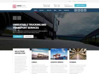
Yes, I am talking about these inaccessible, bloated, unusable, stinky, annoying, animated parts of the web. They are so widespread nowadays and implemented everywhere, most of the time with zero consideration about the performance and bandwidth hit. Even we use them. On all our products, except the Readable, that much to say. But here’s why: clients simply demand them and if you aren’t providing any, you are leaving a great part of the money on the table, especially in the WP premium themes business we’re in.
We already tried to release one of our products without the slider, providing instead the fully configurable jumbotron area for the home page. As soon as the item was approved on the ThemeForest, we started getting questions if the theme has any kind of slider available and why not. So after the initial release our first bigger update fixed that so-much-missing feature. And we were all happily living ever after!
But, were we really?
The Problem
What was a trend for quite a while now among the authors on the ThemeForest, most of them simply solve the demand for the slider by including one of the existing solutions. Plugins for WP such as Revolution or Layer slider seems to be the most popular choice. But by doing so, they usually solve the problem on their part and introduce more hassle on the client-side. From my experiences, these are very common:
- Author will not update the item regularly enough, the slider will update in the meantime but as long as the slider is added as a free bonus to the theme, the client will not be able to get the latest version if the author doesn’t handle that manually. Here is a great example how serious the consequences can be.
- On the demo page everything seems super fancy and polished, but it’s usually very hard for the clients to get/prepare the right imagery that will work for their business. Especially with the layers and transparent PNGs.
- The admin interfaces of these sliders are usually like a dashboard from the Boeing 747. It really takes time and effort to create even the simplest slider, without any text layers and animations. If I buy a template, I want to get the site up and running as quick as possible, not reading tons of documentation how to create a fucking slider.
- With great power comes great responsibility. The performance impact on the site can be considerable if you use the right tooling, have a proper hosting, CDN etc.. Unfortunately this is usually not the case. End users (or their web dev companies) will usually just upload non-optimized big sized images, without preparing the assets for the production use and so on.
The list goes on, of course, I just wanted to point out some of the most common issues I see every day when providing support for our customers.
Still with me? Good!
Predefined Requirements
Before Jaka even started working on the design for the new WordPress template we’re planning, I wanted to have some requirements and goals well defined for the slider part of the website. First of all, we could try to skip the slider feature altogether, but then (very probably) we would be implementing at least something sliderish very soon after the release, since the story of the Carpress would repeat. Instead we decided to give the user an option to use the slider or not, which means that the front page needs to look good, regardless if the slider is present or not (try to dynamically remove slider to some polished WP themes you can see on ThemeForest. Spoiler alert: you will be disappointed).
It was very crucial that we all gathered and shared our thoughts before designing, because it is very easy to design a page module in Photoshop which will look great, but won’t play well in practice once coded.
The recap of about 1 hour session over Skype, we agreed that these are the common ideas about what we wanted to build:
- We are using the Boostrap Carousel JS component. No hassle with the premium plugins. Nice and tidy 🙂
- The slider image is proportionally downsized on the small mobile screens (or should I say it should be proportionally upsized to the desktop, since we are developing mobile-first?). No cutting off the left-right edges, our customers didn’t like that (again, experience from the past).
- Each slide has the additional (optional) meta-data. The example would be the excerpt from the portfolio item shown in slide, the category, CTA button. You get it. This data will be shown in the box over the slider. If there is not enough space available (mobile), the whole meta-data box is moved below the image of the current slide.
- Large, always visible navigation arrows that are also easy to navigate on touch screens.
These were the lowest requirements we wanted to apply in our slider. I think that the big thing is third item in the list (meta-data), since we are providing consistent experience for the user, regardless of the screen size.
The Design
The theme is not released yet, so these screenshots will also be kind of sneak-peek. For the slider part Jaka designed both mobile and desktop version how the slider looks on different screen sizes.
Here is the screenshot from the mobile view:
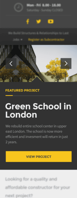
The tricky part here was how to clearly show that the images in the slider and the corresponding meta-data are connected together. The subtle touch with the chevron at the top of the slider elegantly solved this.

Slider looks more or less classic on desktop, not much to say here. The same meta-data box is moved from below the slider to on top of it, a semi-transparent background color is added. Note that the image proportions stay intact.
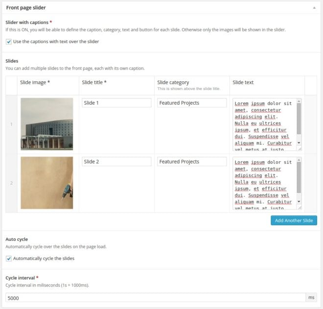
Due to its simplicity, slider is super easy to create in the wp-admin (we took advantage of awesome ACF plugin here) and it doesn’t take more then couple of minutes to set it up – and it is practically guaranteed that the user experience will be consistent no matter the screen size. Here is the screenshot from the wp-admin page editing screen:
I doubt it can get any simpler and cleaner as that.
The Solution
Some starting requirements were easy to meet, for example the big navigation arrows. And since the Bootstrap Carousel is already responsive, keeping the proportions of the images with width: 100%; height: auto; did the trick. We only had to crack two non-trivial problems:
- The layout of the meta-data box and
- Performance issues or trade-off between not-too-large images for mobile, but still large enough for the big desktop screens.
Let’s take a look at these two one by one.
Meta-data Box
Let’s take a look first at the HTML code of the slider:
<div class="jumbotron">
    <div class="carousel  slide  js-jumbotron-slider" id="headerCarousel" data-interval="5000">

        <!-- Wrapper for slides -->
        <div class="carousel-inner">

            <div class="item  active">
                <img srcset="480x135.jpg 480w, 960x279.jpg 960w, 1920x540.jpg 1920w" sizes="100 wv" alt="Green School in London">
                <div class="container">
                    <div class="carousel-content">
                        <div class="jumbotron__category">
                            <h6>Featured Project</h6>
                        </div>
                        <div class="jumbotron__title">
                            <h1>Green School in London</h1>
                        </div>
                        <div class="jumbotron__content">
                            <p>We rebuilt the entire school center in upper east London. The school is now more efficient and investment will return in just 2 years.</p>
                        </div>
                    </div>
                </div>
            </div>


            ...<!-- more slides -->

        </div>

        <!-- Controls -->
        <a class="left  carousel-control" href="#headerCarousel" role="button" data-slide="prev">
            <i class="fa  fa-angle-left"></i>
        </a>
        <a class="right  carousel-control" href="#headerCarousel" role="button" data-slide="next">
            <i class="fa  fa-angle-right"></i>
        </a>

    </div>
</div>
The HTML markup is very similar to the one from Bootstrap. Hey, it is Bootstrap carousel, right? There is one important difference though, but I’ll explain it a little bit later.
What about the SCSS?
/* Slider Content */
.carousel-content {
    position: relative;
    max-height: 100%;
    z-index: 0;

    @media (min-width: $screen-md-min) {
        background: rgba(51,51,51,0.9);
        position: absolute;
        padding: 15px 30px;
        width: 540px;
        top: 18%;
        left: calc( 50% - 270px );
    }

    @media (min-width: $screen-lg-min) {
        top: 20%;
        width: 500px;
        left: calc( 50% - 250px );
    }

    @media (min-width: 1450px) {
        width: 480px;
        margin-left: 0;
        padding: 30px;
        left: inherit;
    }

    @media (min-width: 1700px) {
        top: 25%;
    }
}

// force 100% width for images
.carousel-inner > .item > img,
.carousel-inner > .item > a > img {
    width: 100%;
}

.jumbotron__category {
    position: relative;
    margin-bottom: 10px;
    padding-bottom: 10px;
    border-bottom: 1px solid rgba(250,250,250,0.2);
    margin-top: 20px;

    @media (min-width: $screen-xs-min) {
        margin-top: 30px;
        margin-bottom: 15px;
        padding-bottom: 15px;
    }

    @media (min-width: $screen-md-min) {
        margin-top: 0;
    }

    &::after {
        position: absolute;
        content: "";
        height: 3px;
        width: 30px;
        background: $primary-color;
        bottom: -1px;
        left: 0;
    }

    h6 {
        margin: 0;
        color: $primary-color;
    }
}

.jumbotron__title {
    h1 {
        font-size: 20px;
        color: #eeeeee;

        @media (min-width: $screen-xs-min) {
            font-size: 25px;
        }

        @media (min-width: $screen-md-min) {
            font-size: 30px;
            margin: 15px 0 10px 0;
        }

        @media (min-width: $screen-lg-min) {
            margin: 30px 0 20px 0;
        }
    }
}

.jumbotron__content {
    p {
        font-size: 14px;
        font-weight: normal;

        @media (min-width: $screen-md-min) {
            margin: 0 0 15px 0;
        }

        @media (min-width: $screen-lg-min) {
            margin: 0 0 20px 0;
        }
    }
}
Everything seems actually pretty simple. Bootstrap Carousel component already does all the heavy lifting for you, all what was left was to display the .carousel-content box below the slide images and when we have enough of space (via @media queries), get it above the image with the absolute positioning. Neat.
Picturefill For Different Images Sizes
Here’s the fact: if you’re having a full width image slider on your page, you cannot cover the entire screen width span with only one image that would be light on bandwidth for mobile and fully sharp on 27-inch Thunderbolt.
Solution? Don’t use a single image!
The new specs for the new <picture> HTML element and the srcset and sizes attributes on the existing <img> are not well supported yet, but here comes the picturefill to the rescue!
If you scroll back up and check the HTML source, you’ll notice that the <img> tags doesn’t have the src attribute. Instead we used just the srcset attribute, along with the picturefill polyfill script, which means we can use the responsive images today!
What does that mean in practice?
We serve the optimized and down-scaled version of the larger images to the mobile users. WordPress can easily handle resizing of your images to predefined dimensions when they are uploaded to the server with add_image_size(), so I added these three lines to my functions.php file:
add_image_size( 'jumbotron-slider-l', 1920, 640, true );
add_image_size( 'jumbotron-slider-m', 960, 320, true );
add_image_size( 'jumbotron-slider-s', 480, 160, true );
For prettier markup in my template files (and to keep my code DRY) I also created this helper PHP function to get the srcset attribute value ready just by calling the function with the right image ID:
/**
 * Prepare the srcset attribute value.
 * @param  int $img_id ID of the image
 * @uses http://codex.wordpress.org/Function_Reference/wp_get_attachment_image_src
 * @return string
 */
function construction_get_slide_sizes( $img_id ) {
    $srcset = array();

    $sizes = array( 'jumbotron-slider-s', 'jumbotron-slider-m', 'jumbotron-slider-l' );

    foreach ( $sizes as $size ) {
        $img = wp_get_attachment_image_src( $img_id, $size );
        $srcset[] = sprintf( '%s %sw', $img[0], $img[1] );
    }

    return implode( ', ' , $srcset );
}
And that was it. Long live responsive images!
Wrapping Up
Well, sliders can really suck or can be a really nice enhancement to the website. It is all on the designers and projects managers to decide if the slider is really needed on a particular website. And if it is, it is on UX / web developer to provide good user experience, from the usability to performance.
When developing a WordPress theme for a larger audience, it is up to us, the theme authors, that we give our customers just about the right amount of control. At the end of the day they will thank you for making their lives easier.


