

Introduction & Installation
Introduction
GrowthPress is all-around marketing theme with perfect blend of modern design trends and proven internet marketing techniques that convert.
Installation
I assume you already have a fresh copy of WordPress installed on your server.
Download the theme zip file
The first thing you will need to do is to download the theme installation zip file.
If you bought the theme on our ProteusThemes Shop, you should have received an email with the list of themes you have access to. You can click on the theme link with file name ending: -installable.zip or you can login to your account and download the installable zip file from there.
If you bought the theme on ThemeForest, then you have to download the installable WordPress files only zip file from the ThemeForest download section.
Install the theme
You can install the GrowthPress WP Theme in two different ways:
- Upload a zip file - preferred method
When you are logged in your WordPress dashboard go to Appearance → Themes → Add New → Upload Theme and select the theme installation zip file you downloaded from our Shop or from the ThemeForest and click Install Now button. - FTP upload
Unzip the contents of the theme installation zip file and upload the extracted folder to your server towp-content/themes/folder using a FTP client.
Once your theme is on the server, activate it by clicking the Activate button below the preview image in Appearance → Themes
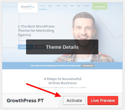
Congratulations! Now the GrowthPress WP Theme is installed.
Registration and Updates
Open Appearance > Theme Registration after activating the theme. Use the license key from your ProteusThemes account, or the purchase code from your ThemeForest download, according to the instructions on the registration page.
Register before using One Click Demo Import. In the ProteusThemes shop version, registration also unlocks the theme's Customizer options. The ThemeForest version does not apply that Customizer restriction, but still requires registration for demo import.
Automatic updates: After registration, the theme can notify you when updates are available. For a ThemeForest purchase, also generate and verify the Envato token requested on the registration page to enable automatic updates. This is separate from your purchase code.
If an available update is not showing, open Dashboard > Updates and click Check Again.
Manual updates: Follow our manual theme update guide to install a newer version yourself.
Customize the Appearance
You can fully customize the appearance of the GrowthPress WP Theme. Go to Appearance → Themes and click on the Customize button:
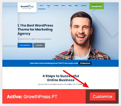
The new window appears and you can now customize the appearance of your theme — upload your custom logo, change the base colors, enable/disable theme features, add custom CSS or JavaScript, etc.
Demo Content
Before importing, activate the required plugins and the plugins used by your chosen demo, then complete theme registration.
One Click Demo Install
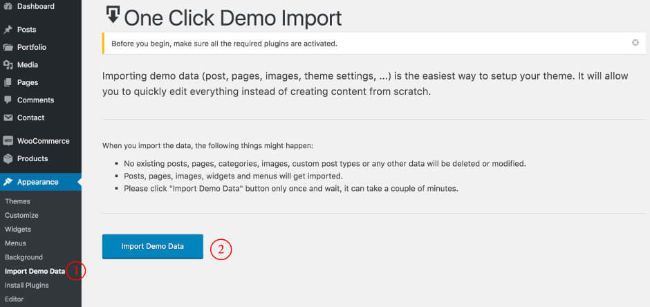
You can import demo content from our demo site (with blurred licensed images) with a single click of a button. Go to Appearance → Import Demo Data and click on the import button.
When setting up a content with your new theme, put special focus on the page speed optimization, especially on the image optimization process. This way you can save on your bandwidth, reduce the bounce rate on your website, and make your users happy. Our themes are created with the speed in mind but large, non-optimized images can and will ruin this experience.
Import XML File
If you want to import the demo content the old-fashioned way, you can get a fresh copy of the XML file on our server at this URL: https://artifacts.proteusthemes.com/xml-exports/growthpress-latest.xml. Don't forget to activate all required plugins before importing demo data. To import the demo data go to Tools → Import, click on WordPress (install the WordPress Importer plugin if not already installed) and upload/import the previously saved xml file (don't forget to enable the Download and import file attachments checkbox to also import the images).
Demo Widgets
After you import the demo content, you can also import widgets the old-fashioned way. The file for widget import is also located on our server: https://artifacts.proteusthemes.com/json-widgets/growthpress.json. Rename this file to growthpress.wie (mind the file extension) and use it in the plugin Widget Importer & Exporter. Go to Tools → Widget Import/Export and import the file.
After import setup
After you have imported the demo data and widgets, you should also setup these things:
- In Settings > Reading, choose A static page and select the homepage and posts page.
- In Appearance > Menus, assign your menus to the theme's available menu locations.
- In Appearance > Widgets, select the appropriate menu in each imported Navigation Menu widget.
- Use Appearance > Customize to set your logo, colors and other appearance options.
These steps are especially useful after a manual XML and widget import. If the demo importer has already assigned pages or menus, check those selections rather than repeating the import.
If for some reason these URLs are not available:
- and you bought the theme on our ProteusThemes shop, you can login to your account and download the extras zip file, or
- if you bought the theme on Themeforest, you can download the All files & documentation zip from ThemeForest
Once the main theme zip file is downloaded you will find the content.xml and widgets.json file in the extras folder.
Header
Logo
The logo can be changed in our Theme Options - Appearance → Customize → Theme Options → Logo.
Favicon
Since WordPress version 4.3, the favicon setting can be found in Appearance → Customize → Site Identity, where you have to set the Site Icon option.
Main Menu
Create a menu in Appearance > Menus and assign it to the Main Menu location.
To display featured-image thumbnails in a dropdown, enable CSS Classes in Screen Options and add pt-special-dropdown to the top-level menu item. Set a featured image on each page linked from its submenu.
Featured Link Button
Configure the header button in Appearance > Customize > [PT] Theme Options > Navigation. Choose a Featured Link page, set the button text above and below, or supply a custom URL. You can also open the link in a new window.
Sticky Menu
In [PT] Theme Options > Sticky Menu, enable the sticky menu and choose its visibility. This menu has separate button, background color and logo settings.
Pages
wp-admin → Pages is the area where you will spend most of your time when building a site. We added a few tools in that process so you can create your pages easier and faster.
Page Templates
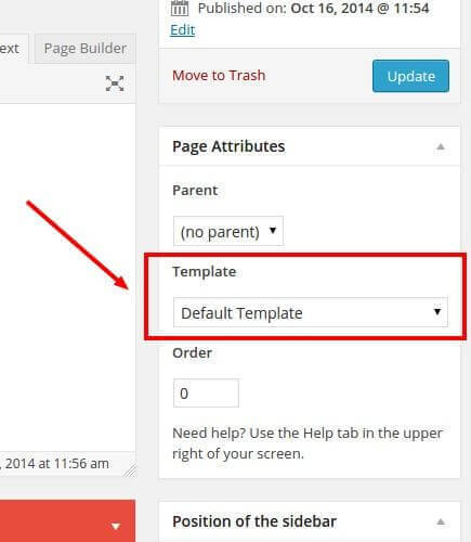
You can choose between 4 different Templates - Default Template, Front Page with Slider and Front Page With Layer/Revolution Slider and Empty Template.
Default Template: Just a default template for simple layouts and Page Builder. First you must choose the Page Builder option under the title and you are ready to go. You can add our widgets here, choose different visual styles and much more. More about that in the next chapter.
Front Page with Slider: This is a unique template which adds an option for a slider in the page options. It can be used with Page Builder. More about that in the Slider chapter.
Front Page with Layer/Revolution Slider: We don't include these two slider plugins with the theme but we make sure they work nicely, since we know our customers want to use them. When you activate this template there is a new Page Slider meta box in which you can put ID/alias from Layer/Revolution Slider.
Empty Template (no header and footer): This is an empty page template and it can be used in many different cases. For example a sales page, which should not show any distraction elements (logo, menu, footer,...). When you select this page template, the options for it will display under the content editor, which allow you to enable certain elements, if you need them (logo, menu, footer). The content can be layout out and created with the awesome Page Builder by SiteOrigin editor.
Blog and single post sidebars
The sidebar options for the blog and the single posts are available in Appearance → Customize → Theme Options → Blog.
Page Options
Use the Page header area box in the page editor to customize the title area and background. The Position of the Sidebar box places the sidebar on the left or right, or hides it. Add its widgets in Appearance > Widgets > Regular Page Sidebar.
The Blog Call To Action widget area appears below the blog list or single posts when enabled in Appearance > Customize > [PT] Theme Options > Blog.
Page Builder
Page Builder is a very powerful tool for making pages. Here is one example of how it looks:
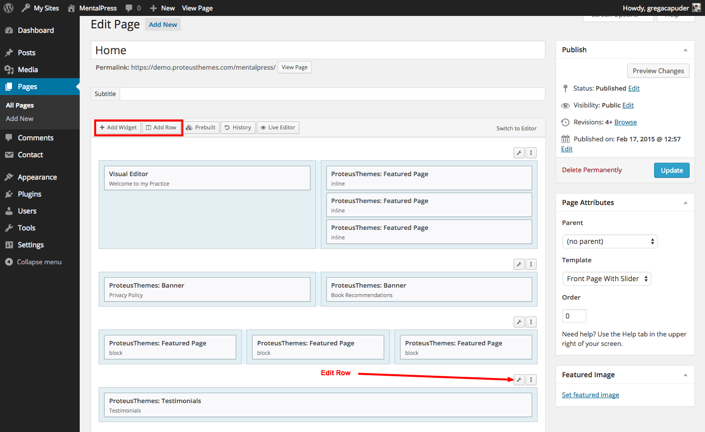
You can make any kind of grid with adding new rows and inside them you put widgets. When you are finished with adding widgets you can also move whole rows up and down.
For more information on how to use Page Builder please visit Page Builder by SiteOrigin documentation page.
For a step-by-step guide to adding rows and widgets, read SiteOrigin's Building a Page tutorial.
Page Builder Row Style
Let's take a look at how we can style Page Builder rows.
To start off we have to click on "Edit Row" for the row that we want to style as shown on the image above. An "Edit Row" window will open, and on the right, there are three setting tabs: Attributes, Layout and Design. Here you can customize different things for this particular row.
In the Layout tab you can set the Bottom Margin, Padding and change the Row Layout to Full Width. In the Design tab you can set the Background Color, Background Image and other things.
Page Builder Widgets
You can use almost any widget in the Page Builder. Let's take a look at a few not so straightforward ones.
SiteOrigin Editor Widget
SiteOrigin Editor will create for you the same editor environment as a normal WordPress editor does. You can use this widget if you want normal text editing options. The SiteOrigin Editor Widget is part of Site Origin Widgets Bundle.
Call to Action Widget
How do I add a button? With our custom shortcodes. You can find instructions in the Buttons section.
Featured Page Widget
Featured Page is a really simple widget that we use in Page Builder. All you have to do is to select the page and one of the two layouts we made for you.
But how do I change the image and text on the Front Page?
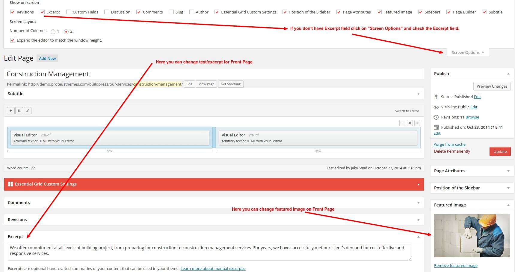
The image on the Front Page is just the normal Featured Image of the selected page. You can change that in the sidebar of every single page. Text can be changed in the Excerpt field which can be found at the end of the page settings. If the excerpt field is not there, you must click on the Screen Option (at the top of the page) and check Excerpt. For more info please take a look at the screenshot below.
Slider
Building a Theme slider has never been easier.
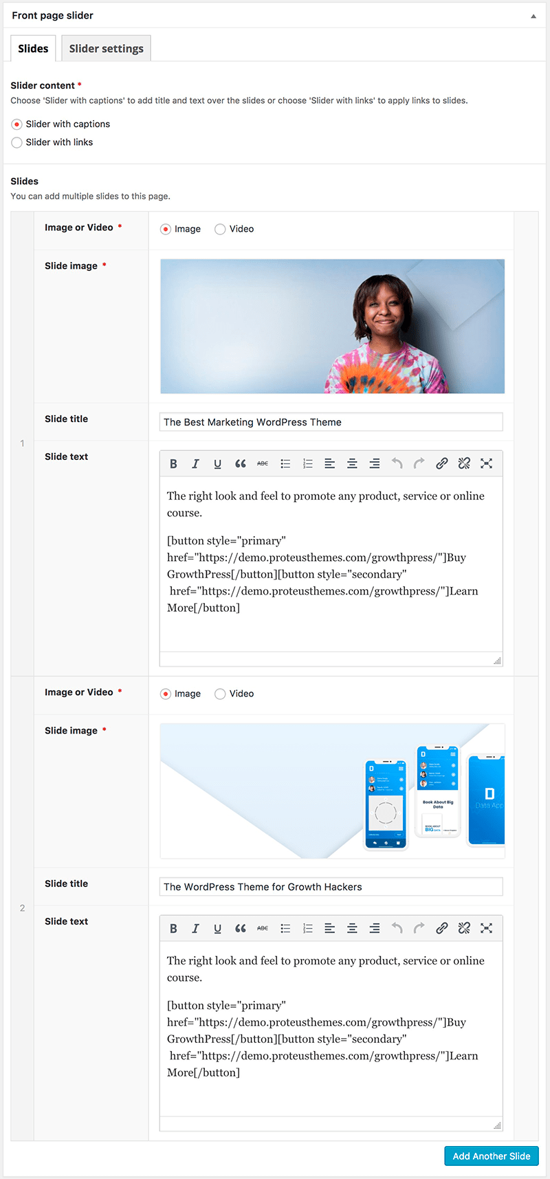
You can create a Theme slider on any page you want. The only thing you must do is choose the page template Front Page With Slider (you can use this template even if it's not for the front page). After you select this page template there will be a new meta box at the bottom of the page which is called Front page slider. Now you can add images or videos to your slider.
When you add a video, you also have to upload a video "thumbnail", which will serve as a clickable area (also a play button overlay will be added to this image). When a user clicks on this image, the video will open in a pop-up modal window.
As you can see on the example image bellow, you also have the Slider settings tab. In Slider settings tab, you can change how the slider behaves and change the slider options.
This is how the slider backend looks like:
Please take a look at this slider dimensions article for the recommended size of the slider images for this theme.
ProteusThemes Options
You can find all Theme Options in the Customizer: Appearance → Customize. This is a live preview editor for your page.
Here you can change:
- Logo
- Header
- Navigation
- Sticky Menu
- Theme Layout & Colors
- Blog
- Footer
- Custom Code
- Shop (when WooCommerce is active)
- Other
The Blog section controls the number of columns, search and category boxes, single-post reading time, and the visibility of the Blog Call To Action widget area.
Shortcodes
Buttons
Add a button with [button]Your Text[/button]. Customize it with style, href, target, fa, corners, class.
Text: Change the text between the opening and closing shortcode.
Example: [button]New Text[/button]
Style: Choose primary, secondary, danger, success, info.
Example: [button style="primary"]Your Text[/button]
Href: Set the button's destination URL.
Example: [button href="https://www.proteusthemes.com"]Your Text[/button]
Target: Use _self for the same tab or _blank for a new tab.
Example: [button href="https://www.proteusthemes.com" target="_blank"]Your Text[/button]
Font Awesome icon: Add an icon before the text.
Example: [button fa="fa-phone"]Your Text[/button]
Growth icon: Add a growth icon before the text.
Example: [button fa="gp gp-bar-chart"]Your Text[/button]
Corners: Give the button rounded corners.
Example: [button corners="rounded"]Your Text[/button]
Full width: Stretch the button to fill its container.
Example: [button class="btn-block"]Your Text[/button]
Class: Add extra CSS classes to the button.
Example: [button class="btn-lg"]Your Text[/button]
Icons - Font Awesome
Shortcode for Font Awesome is very similar to the buttons shortcode. It looks like this: [fa]
The attributes are icon, href, target and color.
Icon: You can use any Font Awesome 4 icon. To set the selected icon, just get the title of the icon, for example "fa-phone".
Example: [fa icon="fa-phone"]
Href: You can add URL to the icon.
Example: [fa href="https://www.proteusthemes.com"]
Target: You can choose if you want to open the link in the same - "_self" or new - "_blank" window.
Example: [fa target="_blank"]
Color: You can set a custom color to your icon.
Example: [fa color="#ff00ff"]
So a Font Awesome icon shortcode with a home icon, linking to a page and opening in a new window/tab would look like this:
[fa icon="fa-home" href="https://www.proteusthemes.com" target="_blank"]
GrowthPress icons in shortcodes
Shortcode for GrowthPress icons is the same as for the Font Awesome. You are able to use our GrowthPress icons shortcode with the same attributes: icon, href, target and color, so look at how to use these attributes in the Font Awesome shortcode section above. The only difference is, how the icons are passed. Take a look at the example below.
Icon: You can use any Growth icon. To set the selected icon, just get the class of the icon, for example "gp gp-bar-chart".
Example: [fa icon="gp gp-bar-chart"]
GrowthPress Icons
With this theme, we also include custom Growth icon font, that you can use in our theme widgets, shortcodes and elsewhere on your site.
These lovely icons were made by Grega Črešnar ♥.
To insert a growth icon into your custom text, you can use the HTML i tag:
<i class="gp gp-bar-chart" aria-hidden="true"></i>
Here is the list of all growth icons:
Scroll for More
Scroll for more is a little attention grabber which can help you keep the focus of your visitors on the website. It is actually not the shortcode but the piece of the HTML code which you can include anywhere on the site.
<div class="scroll-for-more" style="text-align: center;">
  <span class="scroll-for-more__text">Scroll</span>
</div>
You can also use it without any text. In that case delete <span> class around the text. Example:
<div class="scroll-for-more" style="text-align: center;"></div>
Plugins
We also use and support some of the best plugins for WordPress.
Required and Recommended Plugins
You can install and activate these plugins by going to wp-admin → Appearance → Install Plugins.
The list of required and recommended plugins used in this theme:
These groups match the required and recommended labels in the theme's plugin installer. Install recommended plugins when you need their features.
Required plugins
- Advanced Custom Fields
- ACF Repeater Field (bundled with the theme)
- ProteusThemes Shortcodes (installed from the developer's download)
- Page Builder by SiteOrigin
- SiteOrigin Widgets Bundle
- One Click Demo Import
- Breadcrumb NavXT
- Classic Editor
- Classic Widgets
Recommended plugins
- Contact Form 7
- WooCommerce - excelling eCommerce
- MailChimp widget by ProteusThemes
- ClevrBot (installed from the developer's download)
Contact Form 7
We use Contact Form 7 for our Contact Us page. This is the code from our demo:
<div class="row">
  <div class="col-12">
    [text* your-name class:form-control placeholder "First Name*"]
  </div>
  <div class="col-12">
    [tel your-number class:form-control placeholder "Phone Number"]
  </div>
  <div class="col-12">
    [email* your-email class:form-control placeholder "E-mail*"]
  </div>
  <div class="col-12">
    [textarea your-message class:form-control placeholder "Message"][submit class:btn class:pull-right class:btn-light "Send Message"]
  </div>
</div>
After that just place the plugin's shortcode into your Contact Us page.
WooCommerce
Activate WooCommerce to add a store to your site. Follow its onboarding steps, then use WooCommerce > Settings to configure your store, shipping, taxes and payments.
If your chosen theme demo includes products, activate WooCommerce before you import that demo so its product data can be imported.
Optional sample products
For a test store, WooCommerce supplies a sample_products.csv file in the plugin's sample-data folder. Download the WooCommerce plugin ZIP and extract that file, then open Products > All Products and use the product import button. Select the CSV, review the column mapping, and run the importer.
Alternatively, use Tools > Import > WordPress to import sample-data/sample_products.xml from the same plugin ZIP. Select Download and import file attachments if you also want the sample images. See the WooCommerce sample-data guide for both methods.
Shop sidebar
Open Appearance > Widgets to add the available product widgets to Shop Sidebar. WooCommerce must be active for this sidebar to appear.
For product management and store configuration, see the WooCommerce documentation.
Breadcrumb NavXT
The breadcrumbs in this theme are powered by the Breadcrumb NavXT plugin.
All the settings for breadcrumbs can be found in Settings → Breadcrumb NavXT. Here you can define a separator (which should be empty by default for our themes), breadcrumb hierarchies for different pages (pages, custom post types, taxonomy, ...) and set other breadcrumbs related things.
Footer
Last but not least there is our footer area. The footer area is divided into:
Footer Widgets
Footer Widgets is the place where you can add the last things to your page. You can add widgets in the Apperance → Widgets → Footer. There are also few options for that area in Appearance → Customize → Theme Options → Footer. You can changes different colors there.
Bottom Footer
The Bottom Footer area is the place for copyrights or some custom text. Custom text for the left and right side of the bottom footer can be added in live customizer Appearance → Customize → Theme Options → Footer.
Translations
Manual translation
We have an article with a video on how to translate our themes.
WPML for Multilingual sites
This theme officially supports WPML. Head over to the WPML website, buy the subscription, then install the main plugin — likely the OTGS Installer Plugin. When prompted to download, install, and activate specific WPML plugins, make sure to install and activate these:
- WPML Multilingual CMS
- String Translation
- Media Translation
WPML’s setup wizard will also prompt you to install other plugins if it thinks you need them. For example, if this theme includes a WooCommerce-based site, WPML will prompt you to install WooCommerce Multilingual & Multicurrency. Install whatever WPML suggests installing.
Extras
Demo Images
All images used in GrowthPress WP can be found on Shutterstock.
Customizations
If you need advanced customizations for this theme, we can do that. See our Theme Customization page for details.
Changelog
View the GrowthPress WP changelog.
Support
If you need more help after all, you can write to us.