Did you ever find yourself making a website with WordPress theme, but the end result didn’t look anything like the theme demo? I listed out 11 common design mistakes that are often overlooked by website makers.
You found the perfect WordPress theme. The demo of the theme looked flawless. Your client liked it a lot and agreed with you to make a purchase. You bought it, installed it and started editing the theme to the client’s needs.
You changed the logo, changed the colors of the theme, inserted the slider images and the content, but in the end, the website you made just doesn’t look like the demo at all. You know something is wrong, but you just cannot detect what. Sounds familiar?
Over the past 5 years, working as a designer in WordPress theme business, I saw countless examples of beautiful websites created with our WordPress themes.
But every once in a while, I see a website with a solid foundation but with a couple of small design mistakes, that ruin the overall experience. I’m talking about small little things that can be easily fixed by anyone.
I know it’s hard to spot these flaws, especially if you are not a designer. For that reason, I decided to write a blog post about how to improve your client’s website to look even better.
Bookmark this blog post and go through the list below the next time you are going to build a website with WordPress theme. It will only take you an hour or two, to remove all the imperfections, but the result will look a 100% better.
1. Poor Contrast of Text on the Slider
I’ve been talking about do’s and don’ts about slider images, so I’m going to be brief now. The principles are simple:
- If the color of the text on the slider is white, choose a dark background. If the slider text is dark, choose a light background.
- Make sure, that the area where the text appears, doesn’t have too much visual noise in the background. Cluttered background reduces the readability of the text on the front and a primary value proposition written on the slider could be missed.

Fortunately for you, a majority of our themes include an option of a semi-transparent solid background behind the text. Our newer WordPress themes also have a shadow applied to all the text on the slider, so the contrast is even better.
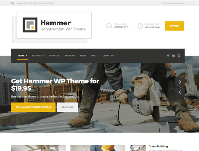
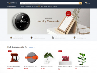
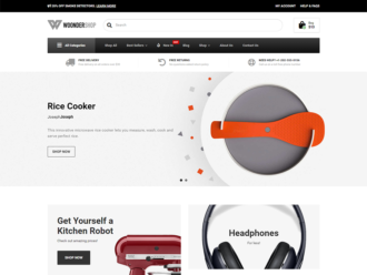
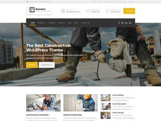
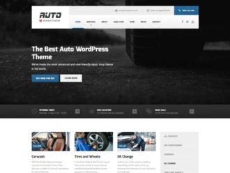
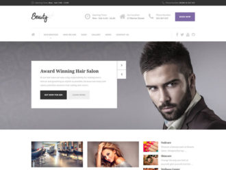
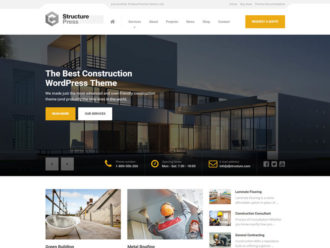
2. Too Big Slider Images
When I look at the websites made with our WordPress themes, I quite often notice, that users use too big slider images. Having a slider image that takes 100% of the height of the screen is only acceptable, if you are a photographer and photos are your final product. In other cases, stay on the safe side and stick with the theme recommendations. It will preserve your website’s perfect visual balance.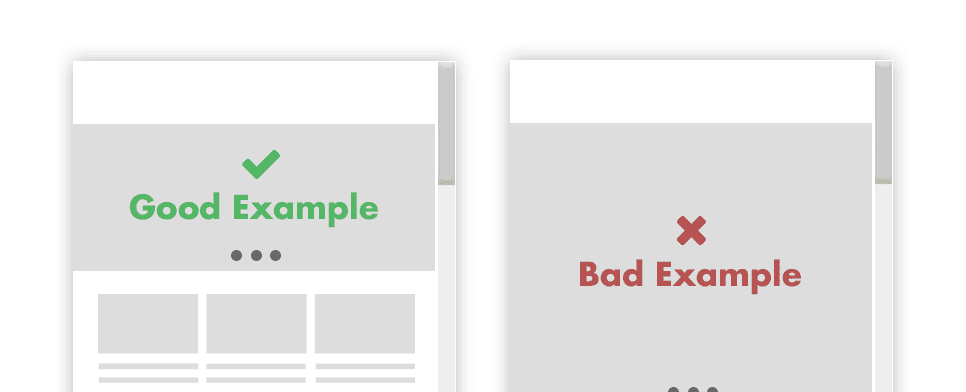
3. Poor White (Negative) Space
White or negative space in web design is a blank space between widgets, text blocks, images or any other part of the website, that helps everything to be organized and deliver a clear, logical flow for the end user.
No matter how hard we try, how we bullet-proof every possible aspect of the WordPress theme, the users always find a way to destroy the white space.
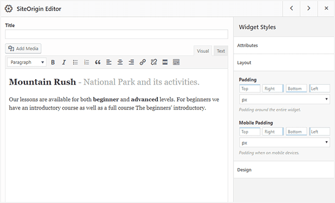
Fortunately for you, we are using a powerful Page Builder in our themes, which means you can adjust your spacings across the website with ease. Page Builder allows you to change the paddings of the widget, paddings of the row and allows you to modify the gutter size between columns.
I’m not going to talk about details and I’d rather give you some practical examples.
- In most cases, website makers use too little white space, which doesn’t allow the content to breathe, so usually, the whiter space you apply, the better result you get.
- Show the relationship between elements with spacing. The elements that go together, for example, the title of the blog post and the date of the post, should be closer together than the elements, that have a different purpose, like date of the blog post and header of the page.
- Be consistent with the spacing. That means that every single row on your website should have the same amount of white space on the top, bottom, left and right.
So, it comes to widgets. They should have an equal amount of paddings and margins applied, no matter where on the page they appear. Consistency will bring balance to your website and draw focus on the thing that matter – the content.
4. Bad Mobile-Friendliness
The procedure and the rules are the same as on the desktop above. You still need to put attention to the white space, but for mobile, there are a couple of additional rules:
- One of them is a finger friendly design. Since fingers are our tools for moving around the website while browsing on mobile, we need to adapt the page to them. When we design a WordPress theme, we make sure, that buttons and clickable elements are not smaller than 50px. If you are adding 3rd-party elements to the WordPress theme, make sure that they are big enough. Also, ensure that those actionable components don’t stick together too much to prevent misclicks.
- Optimize images for speed. Many people access websites on the go, which means unreliable, sometimes poor connection. Try to eliminate a slow site loading (on mobile) and optimize your images.
- Test your website on an actual mobile device. You can resize the browser window to see the mobile view, but when you are done with all the adjustments, take a look at how the website looks on the actual mobile device.
Operating systems, browsers and overall user experience differentiate between desktop and mobile and it could come to some inequalities.
Google developed a mobile friendly test, a tool for checking out if your website is mobile friendly.
We make sure that every one of our WordPress themes passes it with ease.
5. Using Colors That Just Don’t Go Hand in Hand.
Choosing the right color combination is a tricky thing. If you are talented, you can follow your gut feeling. Otherwise, use the tools made especially for that.
I’m going to show you an example:
Most of our WordPress themes are made out of primary and secondary color. If your logo looks like Shell’s, the decision of picking the primary and the secondary color is simple. Red will be used as the primary color for call-to-actions. The yellow one will be a secondary color, used for backgrounds and supportive elements.
If your logo looks like Starbucks’ logo and it’s made out of one color only, you will need to find the secondary one.
One option is to choose the same green color for the primary as well as for the secondary color, but I would highly discourage that.
If you don’t possess a designer’s gut and picking out the color combos is hard for you, I have a solution for you, called Coolors. It is a simple to use tool for creating beautiful color combinations.
Go to their app and insert the hex color code (in my case #006241) of your primary color at the bottom of the column. Then lock it, by clicking the lock icon and press the spacebar.
Tip: Don’t know how to get the hex code of your logo? Check out, if there is a useful Chrome extension for that.
My result looks like this.
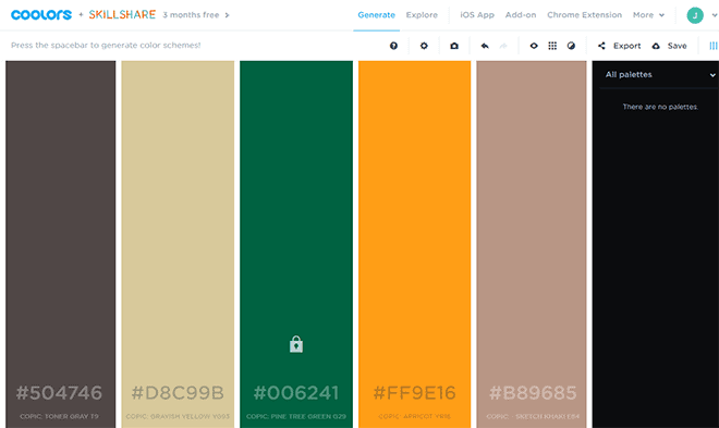
As you can see, all the colors changed, but your primary color stays the same. If you didn’t get the color you like, continue pressing the spacebar.
If your only reason for picking the secondary color is to use it on the website and that color won’t appear anywhere else, don’t choose a color that is too powerful. In our case, the bright orange is out.
You need to choose a subtler color, which won’t destruct your brand and will smoothly support your main color, in our case, green.
My personal choice would be the second beige one (#d8c99b) because it would work perfectly with green and it definitely won’t overtake it.
Maybe this particular beige color is not the perfect color, but it is a good enough option. Here’s why. When picking a color, try to think how dark or white text will look like on it.
In my example, the dark text would look just fine, but adding a little bit more contrast and picking a little lighter beige color, would make it even better.
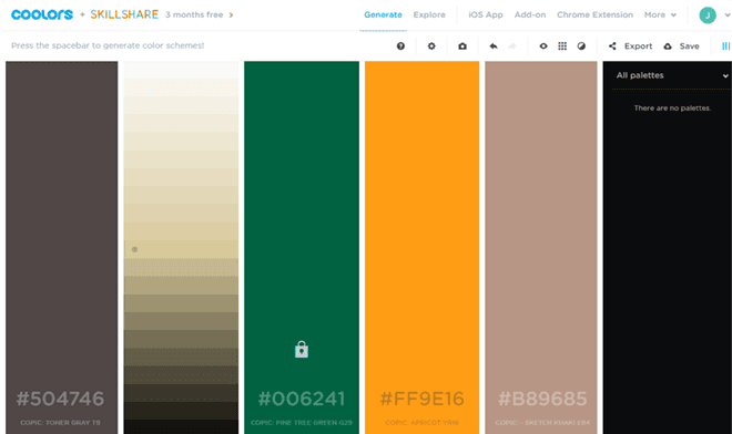
Fortunately for you, Coolors app has another great feature. You can select different shades of every color. Mouse over a colored column and click on the first icon, called “Alternative shades.” Then select the brighter or darker shades and always have the contrast in mind.
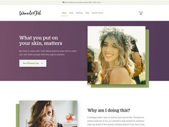
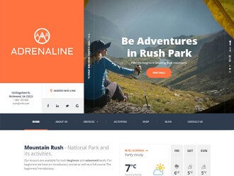
I’ve made a quick demo on how these two colors would work together. For this purpose, I took our Adrenaline WordPress theme and converted it into Starbucks website.
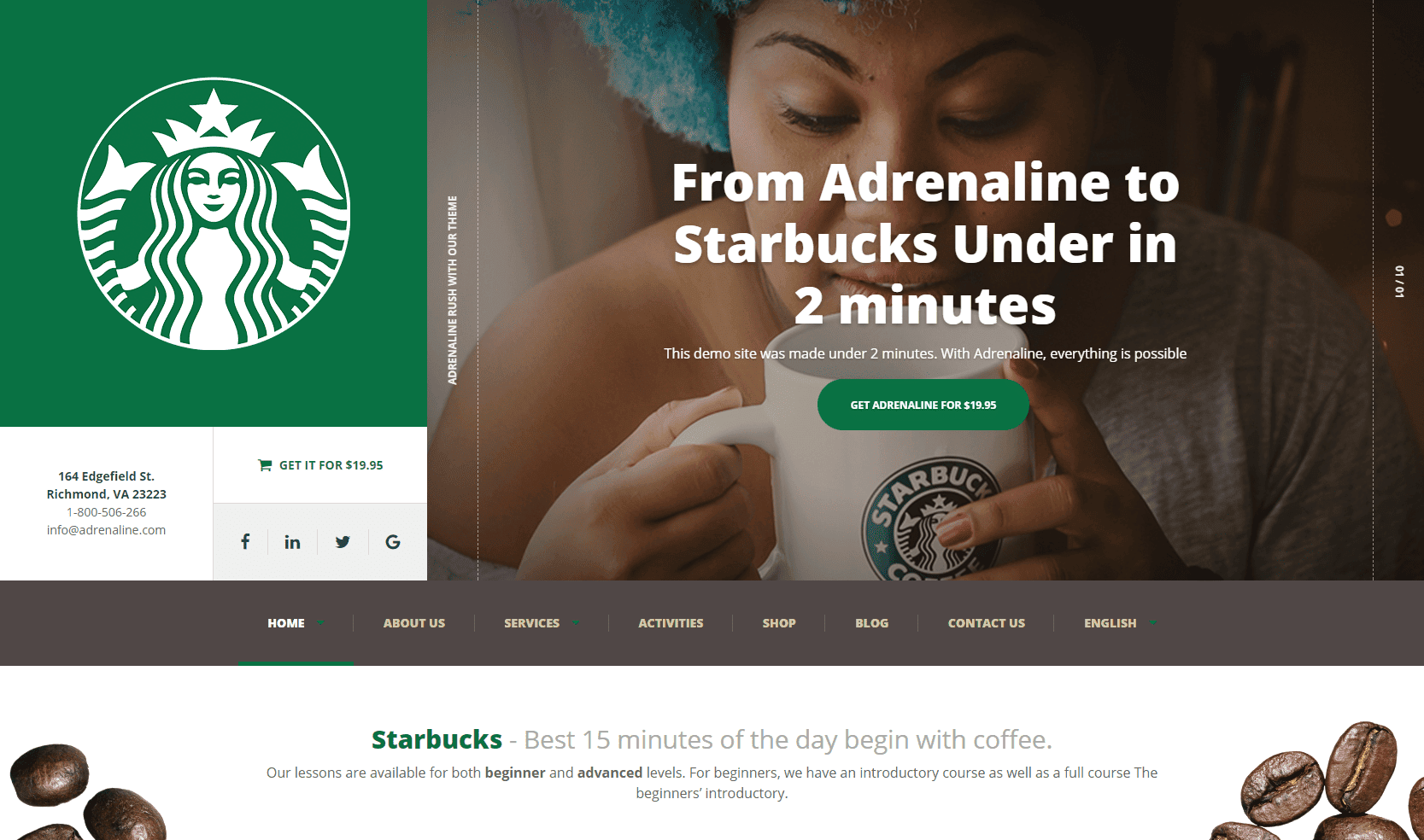
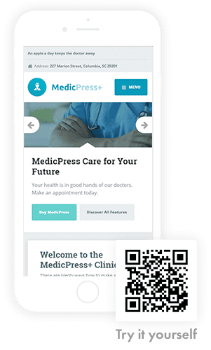
I was impressed by how quickly I’ve changed the Adrenaline WordPress theme into something else completely, in literally 2 minutes. All I had to do, was to change two colors, upload the custom hero image and upload a custom logo. Try it yourself.
6. Don’t Clutter Your Website Navigation
Structure your website navigation in a readable, digestive way. Group less important things in drop-downs or include them in the top bar or the footer. Make the navigation hierarchy logical and ensure, that all the same levels of the menu will have the same priority.
For example, terms and agreements are usually less important than the primary call to action, therefore they cannot both appear on the same level. Put the Terms into a footer and primary call to action into the header.
Keep your main navigation clean, with the maximum of 5 or 6 options.

7. Logo is Too Big
There is a famous sentence, we all get from our client at some point – “make the logo bigger.” Your job, as a website maker, is to educate your client, that there is no need to have a 400 px wide logo because website visitors don’t come to your website to see how beautiful your logo is.
Upload the logo in size, recommended by WordPress theme author. They probably know best which logo size works best with the particular theme.
The logo is just one of many things on the website and it has to play harmoniously with other content.
If you don’t believe me, look at any major brand on the world wide web and you will see that 98% of them has a logo, just big enough to support all the content. The user needs to know, which brand stands behind the website, but he also has to have focus on services, offers and main call to actions.
8. Poor Logo Quality
It happened to me one time, that I got the logo in Microsoft Word (.doc) format. What I want to say is, that clients will always find a way to surprise you.
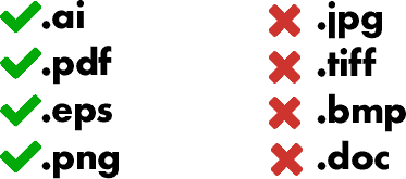
In regards to the logo, it is important to have it in the best possible, pixel-perfect condition. For that purpose, you are going to need a vector format (.pdf, .ai, .svg, .eps). Then you need to go to your favorite vector application (e.g. Adobe Illustrator) and export that logo to the size recommended by the theme maker. That is the best possibility for you to get the sharpest logo.
If you get the logo in a .png, it could work well, but it can lose some sharpness at resizing. If resizing ruins the logo, go to fiverr.com and invest $5 to redraw it into a vector format. Another small investment for a big result.
9. Poor Image Quality
The situation is getting better every year, but I still find businesses that are not putting enough attention or resources into quality photos.
If you have a website selling a particular product, quality images have probably the biggest impact on the prospect and play a crucial role, when a potential customer is deciding whether to buy a product or not.
If your client didn’t provide you with high-quality photos or if he doesn’t have them, it is your job to convince him to invest a $100 and buy them online.
Excellent source of high-quality photos is Shutterstock, where you can get 50 images for $99 per month. It is enough for a small website and will have a tremendous impact on your website users and overall trust in your client’s brand.
Tip: When choosing a photo, try to avoid generic, polished, unrealistic photos. An example of that is a Caucasian guy, with super white teeth and flawless skin.
It can make a counter effect, but most certainly won’t make any impact on visitors. Try to find images with some genuineness. To make it simple, use images that have a realistic look and feel.

10. Not Styling the Third-Party Plugins
In the process of making a new WordPress theme, we always do a research of the niche we are making a theme for. We are always eager to include every necessary functionality in the theme, but sometimes your client just wants something else. That is the time when WordPress plugins come to play.
Nothing wrong with that. After you install and include the plugin into the WordPress theme, take a look at how it looks on the front-end.
I often notice, that our customers forget to style buttons, forms and colors in the same style as the rest of the theme.
Applying already written CSS classes to your 3-party plugin will only take you 10 minutes, but it will have a significant impact in the end.
If you don’t have the knowledge to do that, we can do it for you.
11. Bad Readability
There is a famous claim, that typography is 95% of web design – so do it right.
If you use widgets in the same way as we made the demo of the theme, there won’t be any problems, since we put a lot of effort on good readability, but if you are modifying the layout and style of the fonts, make sure you follow the rules below:
- Every line should have 60-80 characters including spaces.
- If you are setting up a custom line height, multiple the font size with 1.4 to 1.6. If you have a 16px font size your line height should be between 22.4 and 25.6.
- Leave enough room around the text.
- Don’t use too light text color. Everything brighter than #777777 has an adverse impact on readability.
- Don’t use smaller fonts than recommended. The lowest you can go is 14px, but I would recommend you to choose 16px or 18px.
- Be careful with installing custom fonts in the theme. Some fonts are made for headings only and don’t work well on smaller sizes. Some fonts are made for print and don’t work well on screens and some fonts are just made poorly. Think twice when you want to replace the default WordPress theme’s font into something else. If you still want to change it, stick on the safe side and pick the popular ones.
- Use the correct alignment. In 95% of the cases, left text alignment is the way to go. In other 5%, I allow you to use the centred alignment, but please make sure that you use it for short supportive text only.
Right alignment (except for right-to-left languages) and justified alignment are out of the question. Period.
Conclusion:
The next time you will make a website for your client, go through the list above and try to fix all those small imperfections. It will take only an hour or two, but in the end, you will get a much better result, which means a happier client and a better reference. On top of that, you will make us a favor because we will get a fantastic live example to show off.
If you have any question, feel free to comment below.
EDIT: This article has been translated to Dutch – let me know in the comments below if you would like to translate it to your language.