When it comes online stores, there is nothing worse than low e-commerce checkout conversion rates. A low e-commerce conversion rate means the majority of your users abandon the checkout process and you’re not selling as many items as you could which results in less revenue.
There are several reasons why your store could have a low e-commerce checkout conversion rate; from poor design to a complex checkout process. But, one of the most frustrating reasons behind low e-commerce checkout conversion rates is cart abandonment.
While eliminating cart abandonment completely is impossible, the good news is that there are quite a few things you can do to boost your e-commerce checkout conversion rates.
In this post, we’ll explain why customers abandon their carts and share 11 tactics that you can implement on your checkout page to improve your e-commerce conversion rates.
Why Customers Abandon Carts
Cart abandonment happens when a user adds one or more products to their cart and then leaves the store without completing their purchase for some reason. As a store owner, you need to understand those reasons and eliminate them in order to increase the conversion rates.
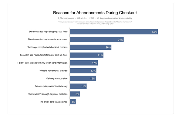
According to the Baymard Institute, cart abandonment rate averages around 69%. Some of the most common reasons why visitors abandon their shopping carts include:
- Unexpected extra costs
- Having to create an account
- Complicated checkout process (too many unnecessary forms)
- Security concerns (poor design)
- Lack of payment methods
As you can see from the screenshot below, there are a few other reasons why customers abandon their shopping carts which contributes to low e-commerce checkout conversion rates. However, the good news is that you can easily address these concerns and boost that conversion rate.
11 Ways to Improve E-Commerce Checkout Conversion Rates
Below, you’ll find 11 tips that will help you improve the conversion rates on your store. From improving usability issues to addressing security concerns, once you implement these tactics in your store, you’re bound to see less cart abandonment and more successful purchases. However, before doing changes, set up an A/B test to help you understand which changes have the most impact and lead to better conversions.
1. Consider Switching to One-Page Checkout
A long and complicated checkout process is commonly listed as one of the reasons why conversion rates are low when it comes to e-commerce checkout. Despite these statistics, there is no definitive answer on whether or not you should have a single or a multi-page checkout process. In fact, there are studies that show examples of a multi-page checkout converting better as well as studies that show that a single page checkout converts better. In general, however, the following holds true.
A single page checkout form performs better due to a couple of reasons:
- A single-page checkout is seemingly shorter and encourages customers to complete the purchase
- A single-page checkout requires fewer clicks, a fact which has been proven to lead to better conversion rates through behavioral research.
If you’re seeing low conversion rates on your e-commerce checkout page and use a multi-page checkout, consider switching to a WooCommerce theme with one-page checkout.
A single page checkout could significantly improve your conversion rates if you have a low average order value. If, on the other hand, you have a high average order value, research has shown that multipage checkout performs better in terms of conversion rates.
2. Display Trust Badges
According to the Baymard Institute, 17% of shoppers abandon carts due to security concerns. A professionally designed store is one of the best ways to alleviate security concerns. Another great way to alleviate security concerns is to display trust badges not only on your site but also on your checkout page.
Trust badges such as McAfee or Norton logos, PayPal logo, e-Trust logo, and others signify that your checkout process is secure and that your store can be trusted. It signals to the customers that their information won’t be misused and as a result contributes to higher conversion rates.
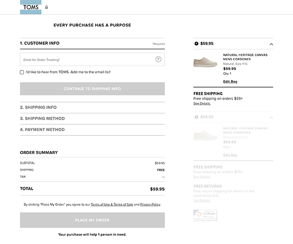
You can see trust badges in action on TOMS checkout page in the screenshot below.
3. Add Your Phone Number
Some of your customers will have a lot of questions and concerns as they browse your store. They may wonder about your shipping or return policies or have additional last-minute questions about products you’re selling. If they can’t find the answers they are looking for, there is a high probability that they will abandon their cart and go someplace else.
By displaying your phone number on the checkout page, you’re giving your customers an easy way to contact you. You can then answer their questions, solve any issues they might have, and even guide them through the checkout process towards a successful purchase.
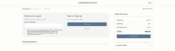
Anthropologie displays their phone number at the very top of the checkout page.
4. Offer Multiple Payment Methods
There is no doubt that credit cards are one of the easiest ways to accept payments on your site. However, not all of your visitors are willing to share their credit card information online. When you take into consideration the rising number of online threats, it’s no wonder why they would be leery of handing out their sensitive financial information and more prone to abandon their cart instead.
Prevent this from happening by adding additional payment methods such as PayPal, Apple Pay, direct bank transfer or cash on delivery. Enabling extra payment methods can be as simple as enabling them in your WooCommerce settings or installing additional payment plugins for WooCommerce. This allows your customers to choose the payment method that’s most convenient for them, increases their trust in your brand, and encourages them to complete the purchase.
5. Add Urgency Countdowns
Urgency is one of the most powerful aspects of human psychology that drives us to act quickly and without overthinking. When we perceive an item to be scarce, we are more likely to act and buy it to ensure we’re not missing out.
There are several ways to add urgency to your store. For example, you can add urgency by limiting the time available to complete the purchase, displaying low stock notifications or running limited-time discounts on certain products.
6. Make Your CTAs Noticeable
When it comes to e-commerce sites, CTAs often include buttons such as Add to Cart, Continue to Checkout, Buy Now, Finish Purchase, and similar. If you want to increase your conversion rates, those call to actions should be noticeable. In other words, they should be prominent throughout your store as well as on the checkout page.
Make your CTAs big so visitors on smaller screens can easily click them and ensure they use a contrasting color so they stand out from the rest of your site.
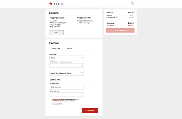
7. Highlight Your Checkout Form
Just as your calls-to-action should be noticeable, so should your checkout form. Otherwise, the checkout form will blend it with the rest of the site and make it harder for customers to understand they need to complete this form in order to complete the purchase.
To make your checkout form stand out, consider using a white background with a subtle drop shadow around your form or make your form background a different color than the rest of your site. Make sure the text on the form is contrasting enough and the font is legible so visitors can clearly understand where they need to enter their information.
Consider the example from Macy’s below where you can see how they use a white background for their checkout form which makes it stand out from the grey background of the page.
8. Use Floating Labels
When it comes to form labels, it goes without saying that they should be large enough to allow comfortable typing even on smaller screens. However, there is one more consideration to keep in mind when it comes to checkout forms.
According to MDS, using floating labels has resulted in better checkout conversion rates and makes your forms more interactive. Floating labels also take up much less vertical space which gives your users a feeling that there is less information to fill out which in turn results in better conversion rates.
9. Experiment With Guest Accounts
Having to create an account is another reason why customers often abandon their cart and never return to your site. Given that almost everything is moving to the online world, keeping track of different accounts is not easy, not to mention many users aren’t necessarily interested in handing out their private information.
An obvious solution is to allow customers to checkout without creating an account. Removing the need to create an account led to a $300 million increase in revenue for one major online retailer.
West Elm makes it easy to check out as a guest and complete the purchase without having to create an account.
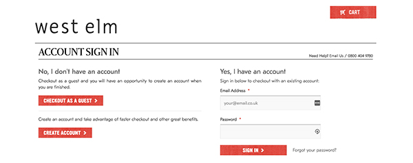
Alternatively, if removing the need to log in is not an option for your store and you still want to get some information from the buyer consider using one-click social logins such as Facebook or Twitter.
10. Display Shipping Costs Upfront
Another great way to increase your e-commerce checkout conversion rates is to display shipping costs as early as possible. Unexpected shipping costs are one of the top ranking reasons for cart abandonment so ensure your customers won’t be unpleasantly surprised when it comes time to complete their purchase.
A great way to overcome the high shipping costs objection is to display shipping cost estimates on product pages and early on during the checkout process. Alternatively, consider adding a shipping calculator to product pages so customers can choose the most convenient shipping method with an acceptable cost.
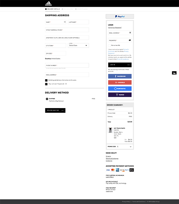
11. Highlight Your Policies
Lastly, keep in mind that as convenient as online shopping is, it also comes with a few downsides which include shipping costs and times as well as return procedures and policies.
Online shopping allows us to buy from the comfort of our own homes without spending long times in the checkout line. At the same time, we also want to know that the items we bought will be delivered as soon as possible and that shipping costs won’t be the same or more as the item we’re buying. As such, you should clearly display your shopping policies on the checkout page.
![]()
The same principle applies for return policies as customers want to know what to do in case they are not happy with their purchase or the item arrives damaged.
You can display both shipping and return policies and guarantees with simple icons, text or badges that highlight free shipping or money-back guarantees, instead of linking to those pages on your site like Adidas does in the example below.
12. Abandoned Cart Emails
If the above optimization tips don’t work, consider implementing an automated abandoned cart email for WooCommerce. This will send an email to shoppers who have engaged with your checkout process, but didn’t complete the sale.
These emails are very effective as it gives you the opportunity to share a useful resource that re-engages the shopper and may convince them to finish the purchase. Examples of great resources include a special discount code, links to similar products that might be a better fit, or a link to a glowing review of your product.
Final Thoughts
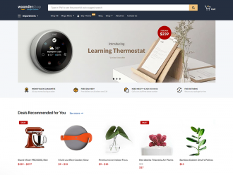
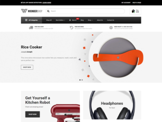
Improving e-commerce conversion rates in your store is not difficult once you know what causes people to abandon their carts and have the proper tactics to combat cart abandonment. Use the tips in this article to improve your e-commerce checkout or check out our Woondershop theme that’s been designed with better e-commerce conversion rates in mind and has all of the features mentioned above already in place.